Jupiter mobile: Sidebar Redesign
Created a modern and direct approach wallet switcher sidebar
SKILLS
Product Design / Product Strategy
MY ROLE
I started working on the JUP Mobile experience alongside the lead designer. I was constantly involved in design sprint for the V2 of the Jupiter Mobile App.
Worked on a several design sprint to build and redesign new features/systems for the JUP mobile app
Made design decisions that balanced user needs with business goals around retention
Ran prototype testing for new iterations made for easy handoff to the development team
Jupiter is live across multiple regions, Jupiter Mobile is already outperforming earlier iterations, with strong gains in engagement, trading volume, and retention.
The ambition is simple: to build the last onchain finance app you’ll ever need.
*Due to non-disclosure policies, I have omitted and obfuscated company confidential information in this case study
FINDING OPPORTUNITIES TO DELIGHT USERS
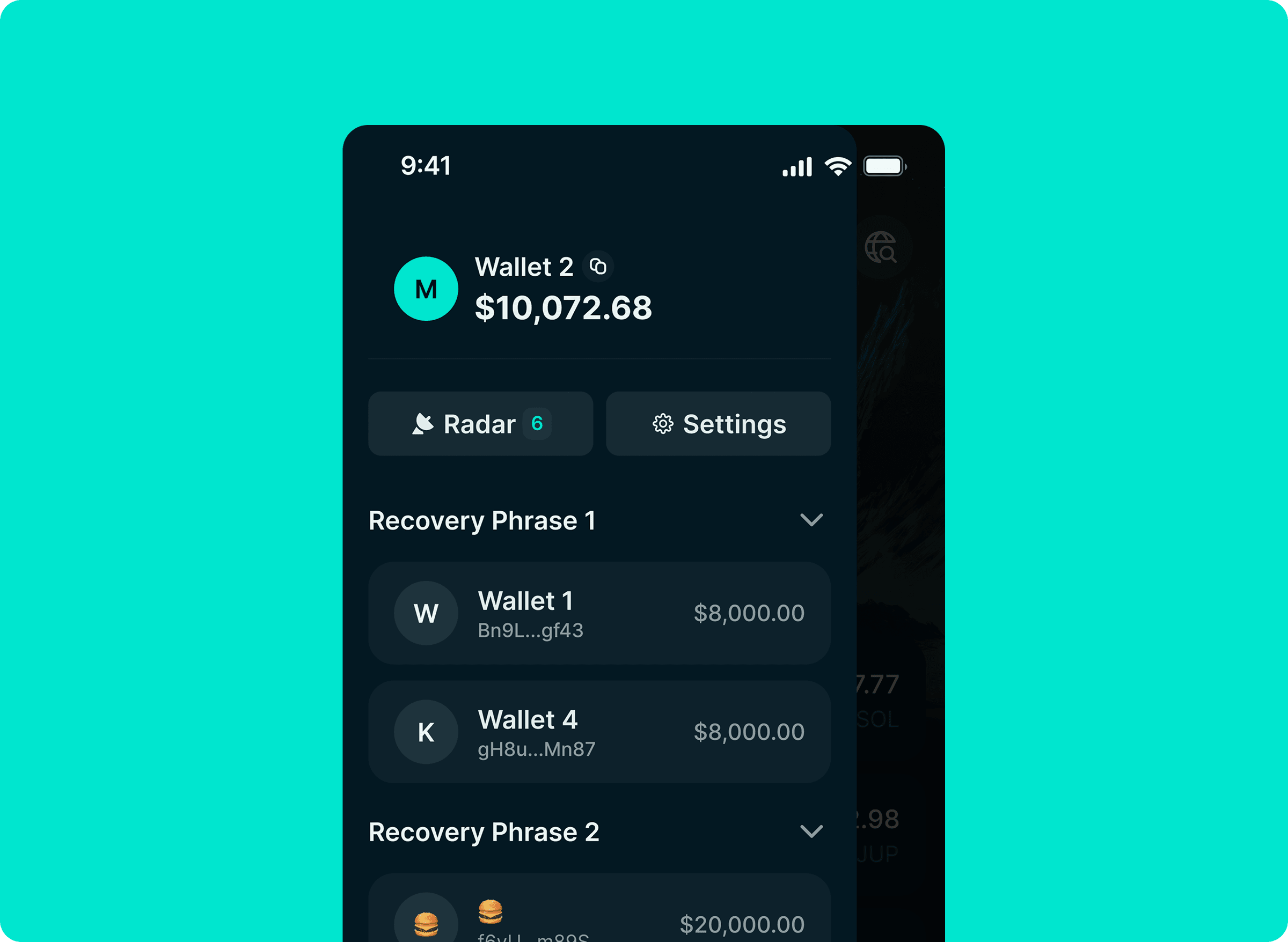
Met up with the lead designer, was assigned to work on a design sprint (creating a modern and direct approach wallet switcher sidebar UI). I discovered I had the opportunity to add a little bit of delight to the product as i was given creative freedom. The previous sidebar was clean and calm, but a little too passive, i.e some icons and actions lacked intent. Moreover, when testing the Jupiter sidebar experience on mobile, I realised that our wallet switcher sidebar experience lacked the inherent richness that comes with other crypto apps!

DESIGNING A DELIGHTFUL EXPERIENCE
I worked on this project with a timeline of 1 week where i did a full breakdown of the wallet switcher sidebar. My goals were simple:
✅ Improve the wallet switcher sidebar.
✅ Include the ability to copy address, edit name of other wallets.
✅ Fix the top section and make wallet balance more eligible.
DESIGN
The first iteration has the selected state remains active as you scroll through the list, as the user continues scrolling, the selected item does not change automatically.
This allows the current selection to stay visible and clearly identifiable at all times, users can scroll past the selected state without affecting their selection.
The selection only updates when a new item is intentionally chosen.
The second iterations allows the selected wallet state remains fixed and visible as the user scrolls through the interface to ensure constant access and clarity.
Scrolling does not affect the currently selected wallet or its state, this behaviour helps maintain context and prevents accidental changes during navigation.


FINAL ITERATION
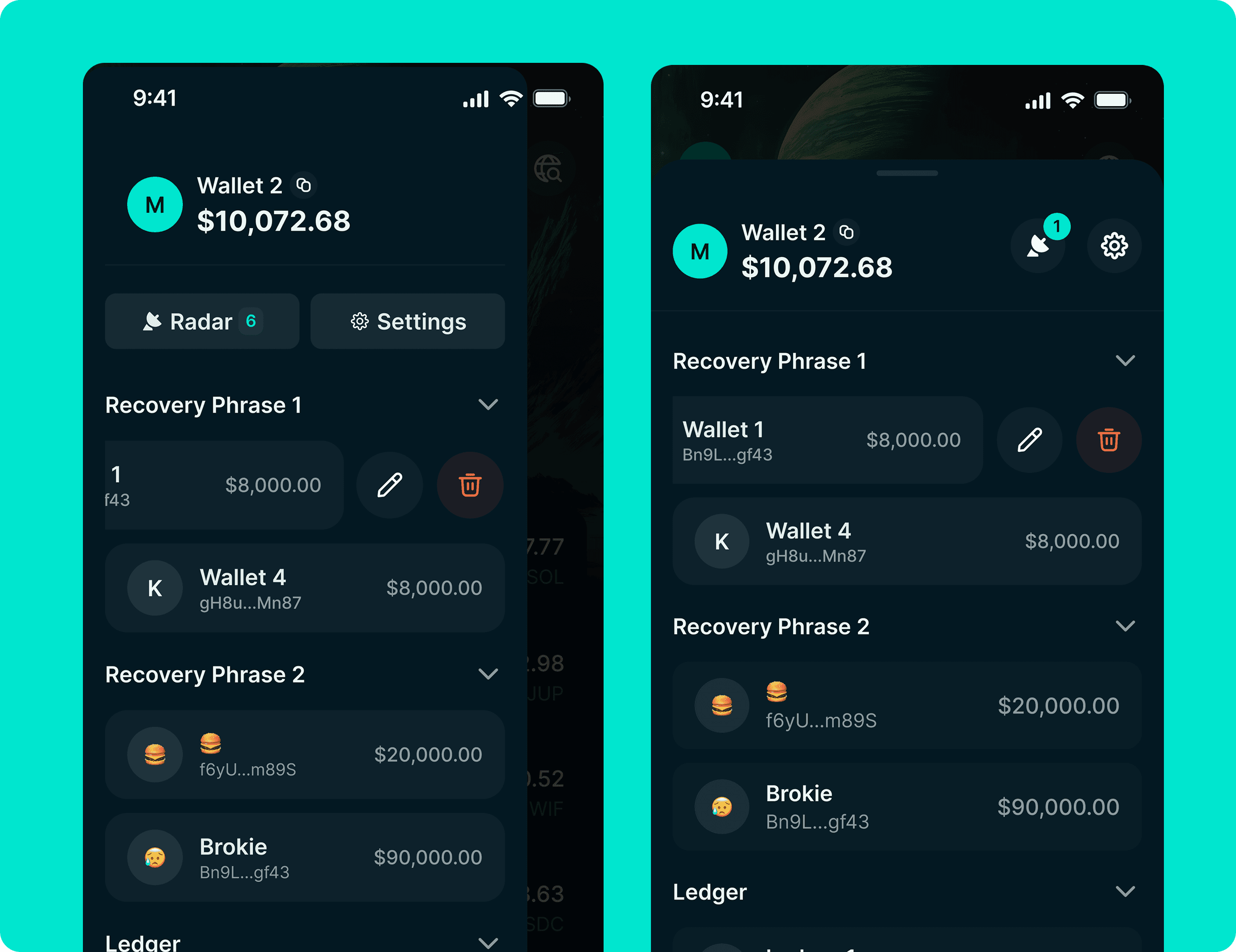
Decide to keep this simple, made the selected wallet state fixed with the top section.
Settings become deprioritised with all socials removed, wallet balance readability got improved, and users can now copy wallet addresses and edit the names of other wallets without disrupting the existing design pattern.
Also included is a swipe action that we have on our wallet selector.

IMPACT
This project primarily focused on improving design and engineering workflows.
"I introduced a modern and direct approach wallet switcher sidebar for the users. This was loved and enjoyed by product, engineering and design team."
KEY TAKEAWAYS
I enjoyed designing new experience used by million of users, I enjoyed working with a team lead that welcomed all my questions. The feedback and insights played a key role in the successful launch of the new wallet switcher.